• BRANDING • GRAPHIC DESIGN • SOCIAL MEDIA
CREATIVE DIRECTION
+ INSTAGRAM TEMPLATES
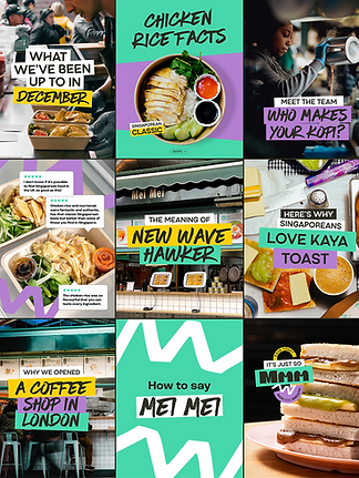
I led creative direction for both Mei Mei Restaurant and Mei Mei Goods Instagram accounts, taking feeds that felt inconsistent and turning them into cohesive and on-brand experiences.
I also designed templates that made posting easier and kept their content looking polished and eye-catching.
At the end of the project, I delivered a multi page style guide that makes following the new creative direction easier for anyone creating content for Mei Mei.

BEFORE

AFTER

BEFORE

AFTER
CONTEXT &
APPROACH
Mei Mei Restaurant and Mei Mei Goods share the same core visual identity, but the goal was to give each brand a distinct presence on Instagram while keeping them cohesive enough for cross-posting.
The Goods account needed to feel modern and fresh while the Restaurant account was meant to feel more traditional and community-driven, inspired by the Singaporean hawker centres.
I achieved this by differentiating colour palettes and visual treatments across both feeds. The restaurant leans into the colour green and darker, moodier photography, while Mei Mei Goods uses brighter, more colourful imagery with a stronger focus on pink tones.
This allowed each brand to stand on its own while still clearly belonging to the same family.


